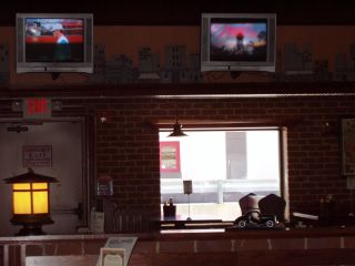
restaurant interior


This is the view opposite the one pictured yesterday (of the fan curtain).
At first I was bummed that I didn't get the window lined up with the edges of the frame, but now I kind of like the off-kilter effect.
Below is the same shot in black and white.


1 Comments:
Nothing wrong with off-kilter, in photography, at least.
By Martin LaBar, at 9:33 AM
Post a Comment
<< Home